Context
Independent restaurants in India mostly run on paper pads, WhatsApp messages to the kitchen, and memory. Enterprise POS systems exist, but they are priced, sold, and — crucially — designed for chains with trained staff and an IT contact. Biller is a cloud POS built for the single-outlet restaurant: AI menu scanning, a shared billing board, a kitchen display system, QR guest ordering, WhatsApp bill delivery, inventory, menu and customer management, and analytics — on a credit-pack pricing model with a genuinely free tier (100 bills a day costs nothing).
This is a real, live product — it shipped at biller.app in June 2026. It's also a long-held idea: a first, local-only version was built back in late 2019 but never shipped. We picked it up again in January 2026 and rebuilt it for real. It's personal, too: I designed it, and my husband, the primary developer, built it. Two people, no funding, real users to win.
The hardest problem: one home, four roles
A POS in a small restaurant isn't used by "a user." In the space of one lunch rush, the same screens are touched by a waiter taking orders, a cook working through tickets, a cashier settling bills, and an owner who wants to know how the day is going. Big vendors solve this with separate apps and training. A two-person team can't ship four apps — and a six-table restaurant won't sit through training for even one.
Waiter
Start a bill and add dishes in seconds, standing up, on a phone.
Kitchen
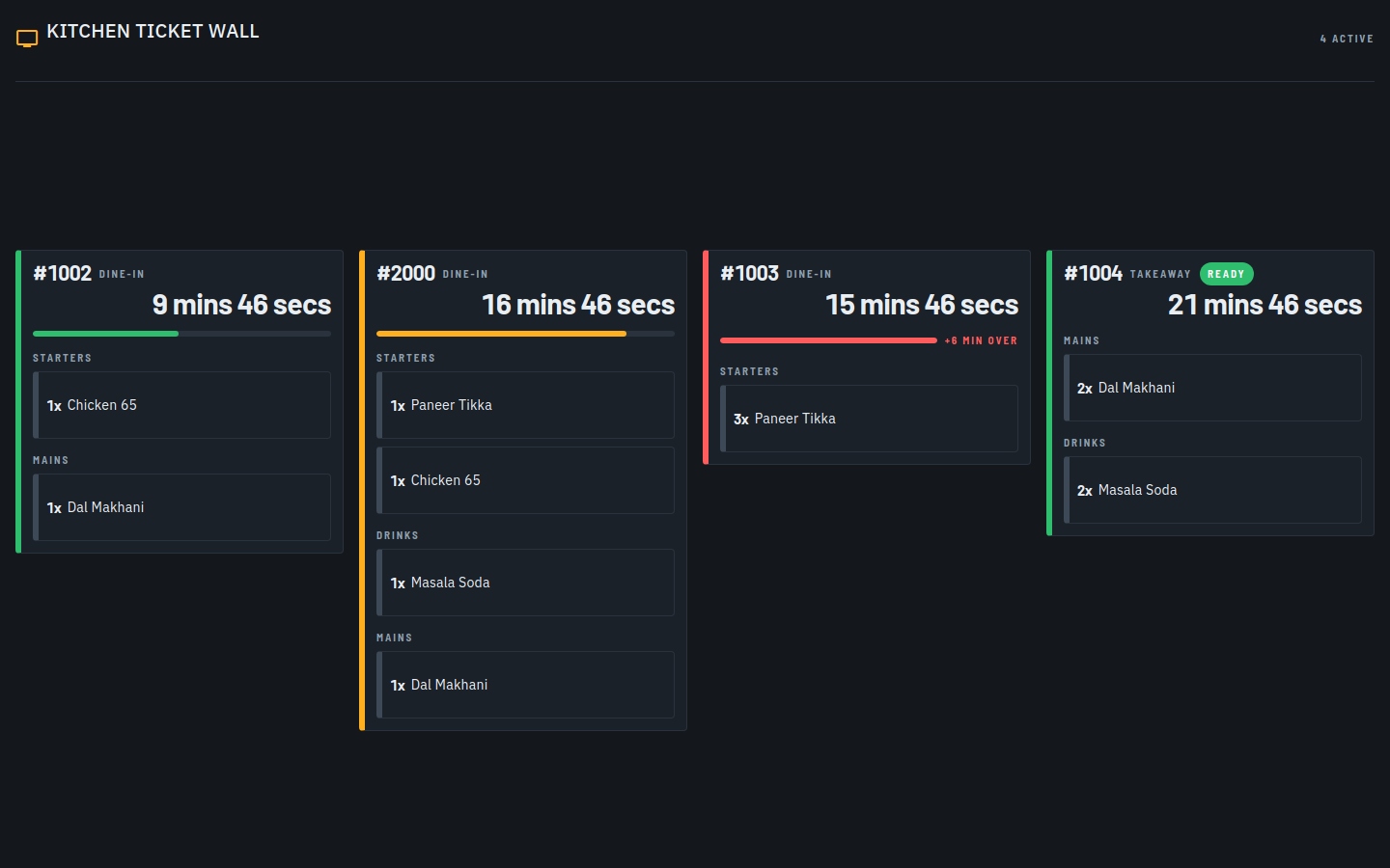
See what to cook, in order, with elapsed time — nothing else.
Cashier
Totals, taxes, discounts, settle & send the bill on WhatsApp.
Admin
Menu, inventory, team, pricing and the day's numbers.
Design question: How might one billing home page serve four different jobs — without modes that confuse, or clutter that slows the rush?
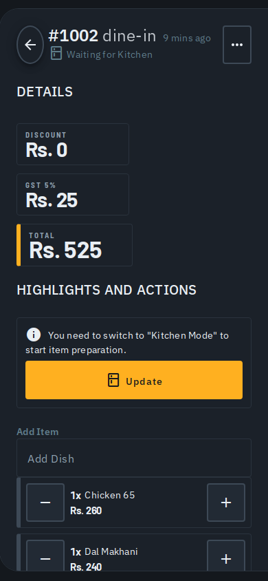
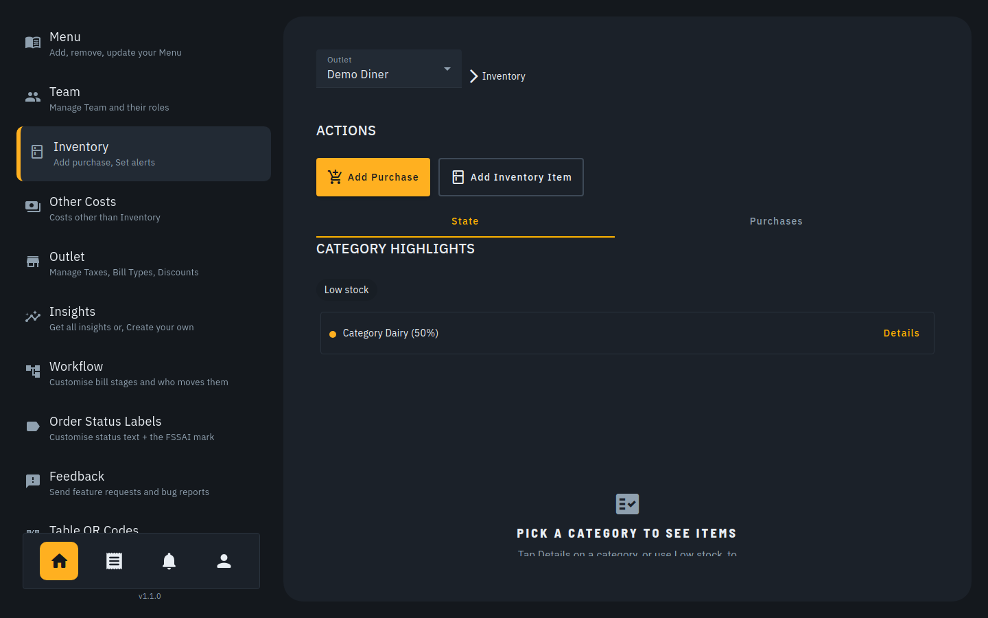
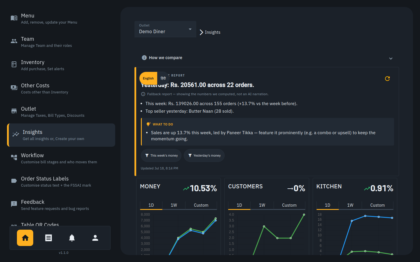
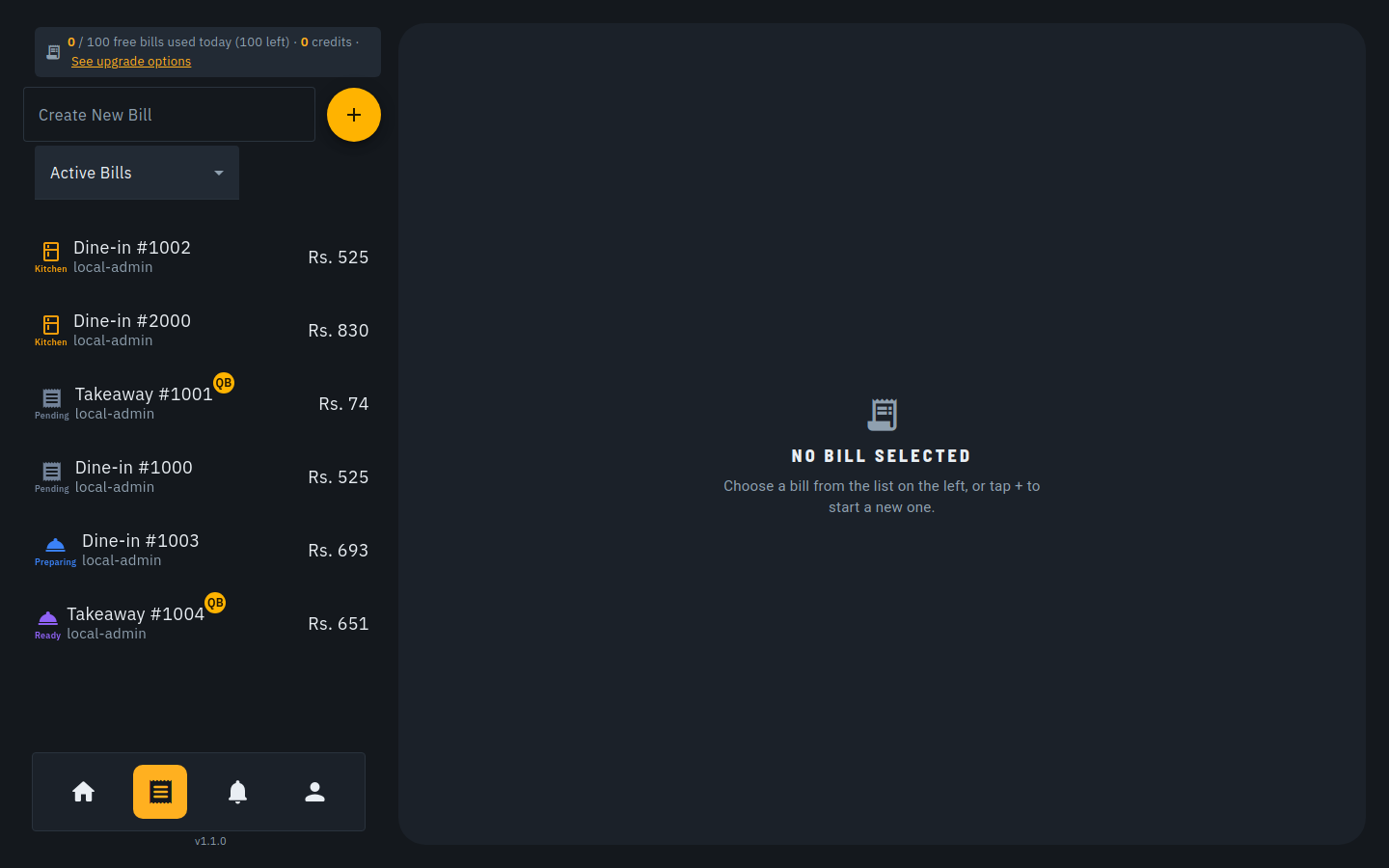
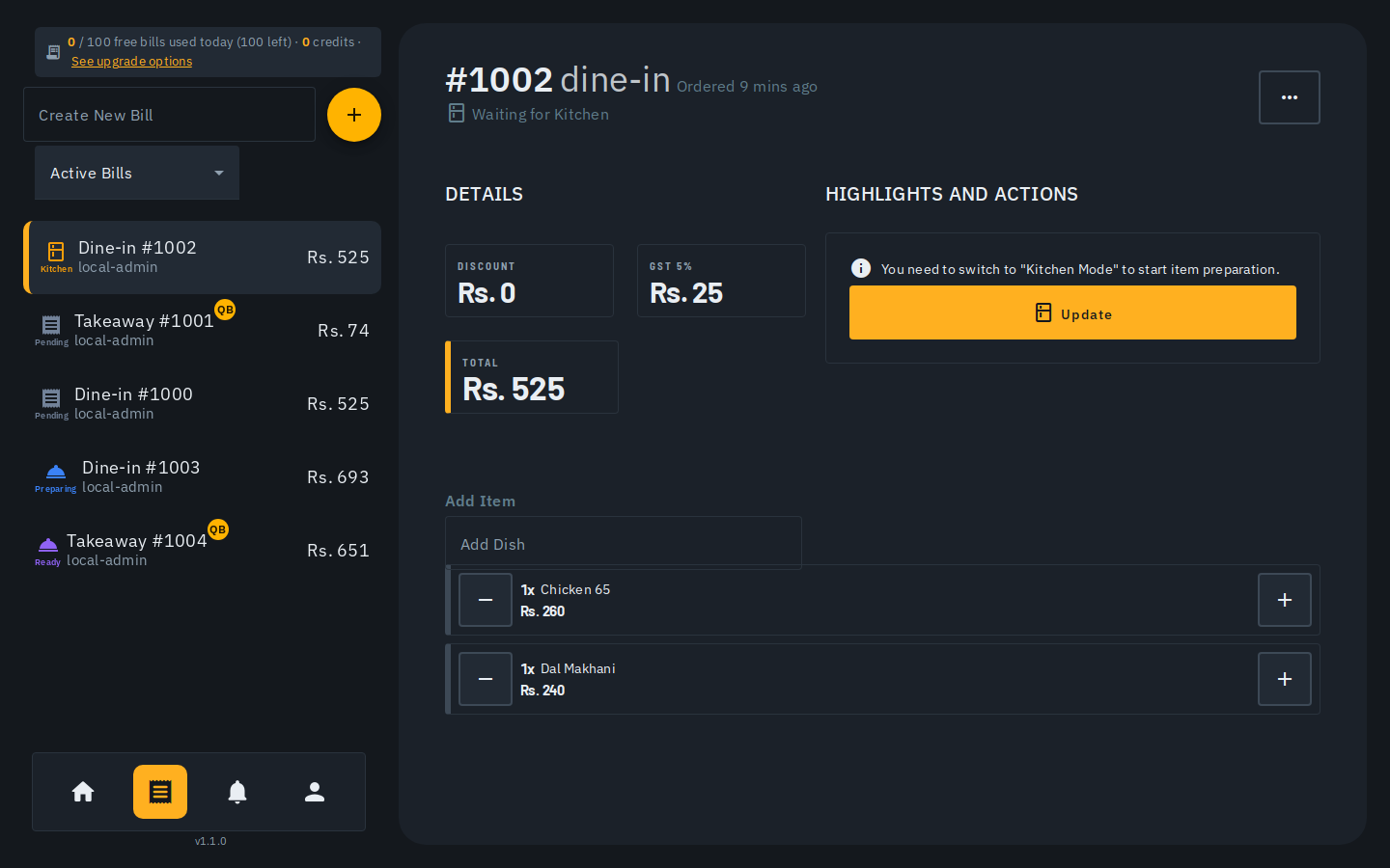
The answer Biller shipped with is a single billing board: one list of live bills, where each bill carries its workflow state (Pending → Kitchen → Preparing → Ready) as a colored, labeled status instead of living in a different app per role. Waiters create and add; the kitchen flips states from the ticket wall; the cashier settles from the same card; the admin's tools sit one tap away in the sidebar. Same mental model for everyone: a bill is a card that moves through states. The second design fight was scope: inventory, customer management and analytics are enterprise features, and enterprise UIs came with them. Each one got re-asked as an SMB question — "what would the owner of a six-table restaurant actually check?" — and cut down to that: inventory leads with low-stock highlights, not stock ledgers; insights lead with plain sentences ("Sales are up 13.7% this week, led by Paneer Tikka"), not chart grids.
The key decision: mobile-first, AI-first onboarding
Before any pixels, I talked to real restaurant owners around us in Bangalore about why they didn't already use a POS. The blocker was never billing — everyone can press buttons on a billing screen. The blocker was setup: getting a full menu, with prices, variants and categories, into the system. That's an afternoon of data entry, so it becomes "next week," and next week never comes. Onboarding friction, not feature count, was the real competitor.
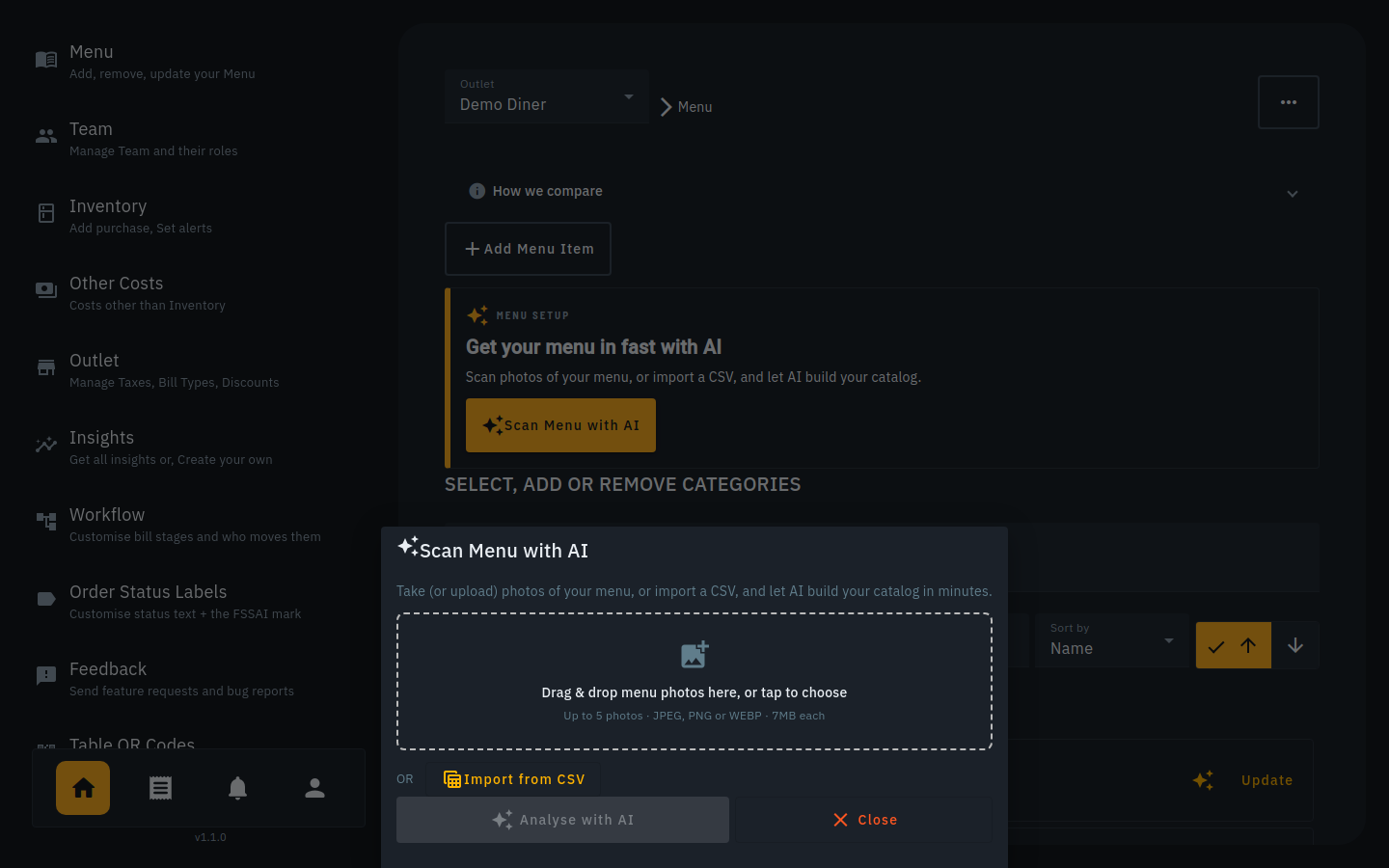
So the product's core became an AI menu scanner: take photos of the physical menu card — the one every restaurant already has — and let AI build the catalog: items, prices, categories. A printed menu becomes a working POS in under two minutes, and the whole restaurant is onboarded in a few clicks. Everything else in setup follows the same principle: the system does the tedious part, the owner only confirms. And because the counter is a phone, not a terminal, every screen was designed mobile-first and then widened to tablets and laptops — not the other way around.
Process: scrappy on purpose
This project ran nothing like an agency engagement, and I won't dress it up as one. The loop was: rough notes from owner conversations → flows sketched in a notebook → wireframes generated with AI assistance → straight into the build. My developer works AI-first, so instead of polishing Figma mockups he'd never open, I specified structure, states and copy, generated wireframes with AI tools, and we argued over the result on a phone screen — usually the same day. Design reviews happened in the running product.
- What I owned: the problem framing, owner interviews, role model, information architecture, screen structure, interaction states, naming and copy — and saying no to enterprise clutter.
- What I gave up: pixel-perfect design files. In a two-person team racing to launch, a maintained Figma library was overhead the product didn't need yet.
- What that taught me: the artifacts are negotiable; the thinking isn't. Working lean sharpened exactly the skills I use in enterprise settings — deciding what matters and proving it in the shipped thing.
Going back to do it properly: the billing-screen redesign
Shipping lean got Biller live — but it left the core billing screen under-designed. After launch I went back and rebuilt it as a proper, annotated mid-fidelity wireframe, then iterated it twice against real feedback rather than my own taste:
- Rev 1 → Rev 2 — the owner's review. A clearer left rail (Tables / Bills / Kitchen / Out of stock / Admin), a Back affordance on the bill header, remaining credits shown as a progress ring, and search scoped to just dishes and categories.
- Rev 2 → Rev 3 — an on-floor field study. I dropped kitchen-stage language the app can't truthfully know (paper KOTs mean it can't see the stove), renamed the on/off toggle to plain Out of stock, added a Bills screen with Open / Completed / Due, and made “Complete” auto-print once and never block.
Real design tokens (graphite + heat-amber, a 44px tap floor, hairlines not shadows), real dishes and prices, drawn 1:1 across desktop, mobile and every empty/edge state. It's the single clearest artifact of how I take a screen from a rough sketch to something a first-day waiter can use.
The product, in five screens
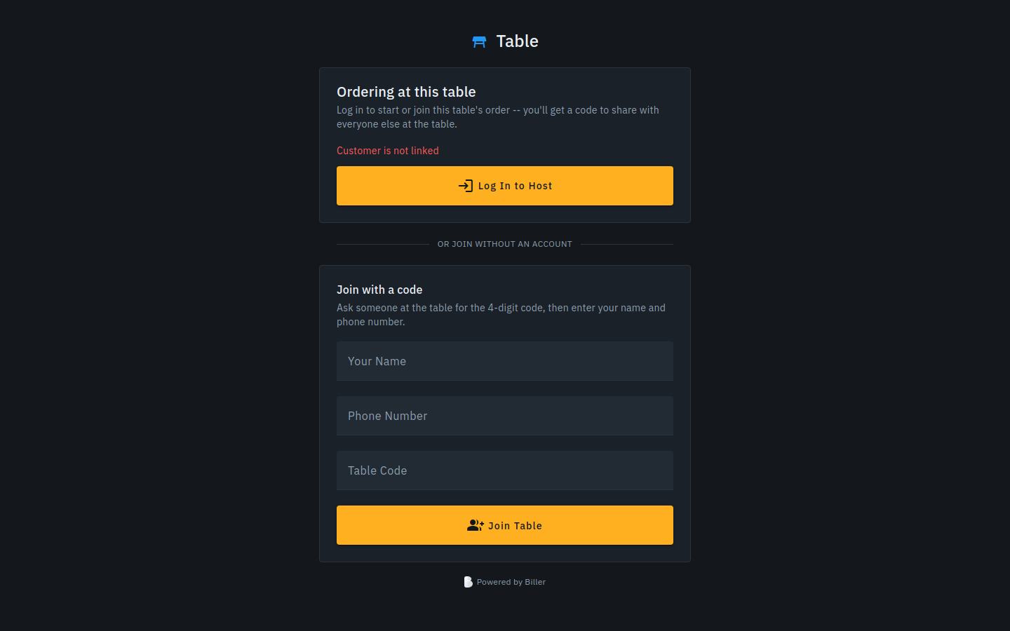
Screens below are from the live product at biller.app.